Splits.
a fairer way to leave things
Challenge:
There are a lot of dating apps out there. They are so well designed that they keep you dating rather than committing.
I thought it would be interesting to build an app that addresses the other side of the coin - continuous separation.
Cost splitting applications such Splitwise, tri-count, ect. But they are dry by design. They dont want to bring in the messy parts of sharing assets and money.
Is there a problem to solve here?
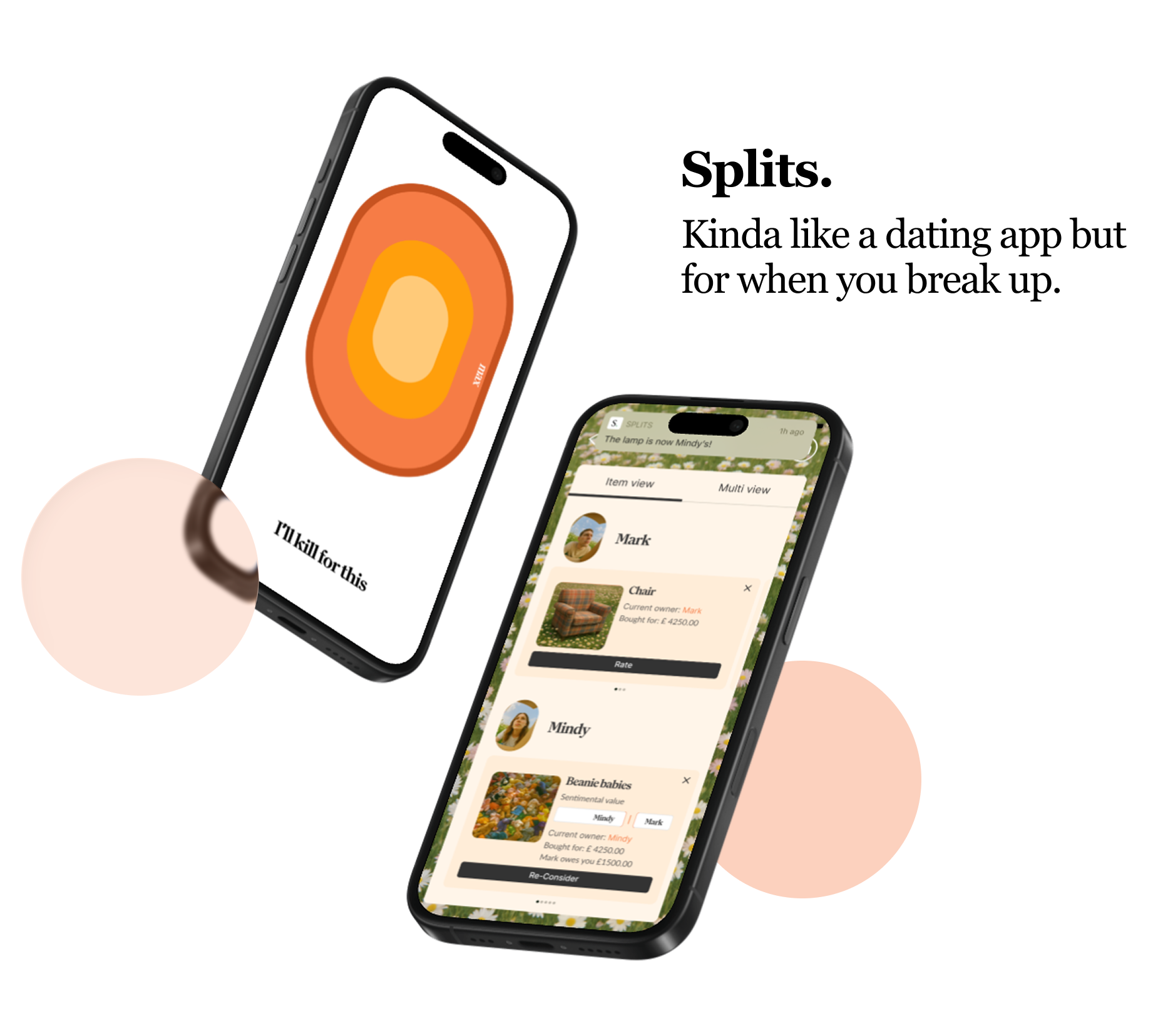
If there was it would be : Splits an asset splitting app that addresses the sentimental side of parting with objects.
Side project: Splits
UI Design exploration
Design system
Visual Universe
UI Engineering Components
April 2025
Process:
Origin Story
Core Interactions
Visual Universe
Building Screens
Additional Interactions
Conclusion
Origin Story
This project started with a little daydream about autolayout and tug of war
Because what if Mindy is more attached to the car?
do they still have to split it evenly?
after years of sharing something is it really about the money you paid for it?
how do you represent how much you both care about something?
In typical design fashion, this led to a “How might we build a series of simple interactions that represent people’s sentimental attachments to shared items, allowing for fairer compromises?”
Core Interactions
I used AI tools Claude MCP and Cursor to build a simple working prototype that brought these interactions to life.
9:41
Splits.
Interaction 1: Tug of War Slider
The goal was to create responsive rectangles similar to Figma’s Auto Layout “fill” behavior. In this prototype, each rectangle’s size is proportional to how much of the total value of an item each individual owns.
Interaction 2: Hold me rating
To capture the emotional side of ownership, I used a press-and-hold interaction — a more intuitive way to express sentiment when there’s no visible or numeric scale. The interaction was designed to link each person’s emotional connection to an item with its financial value, adjusting what they’d pay accordingly.
After finalising the app’s core mechanics, we needed to develop a visual identity, design card styles, and create higher-fidelity screens.
Prompt Design: Visual universe
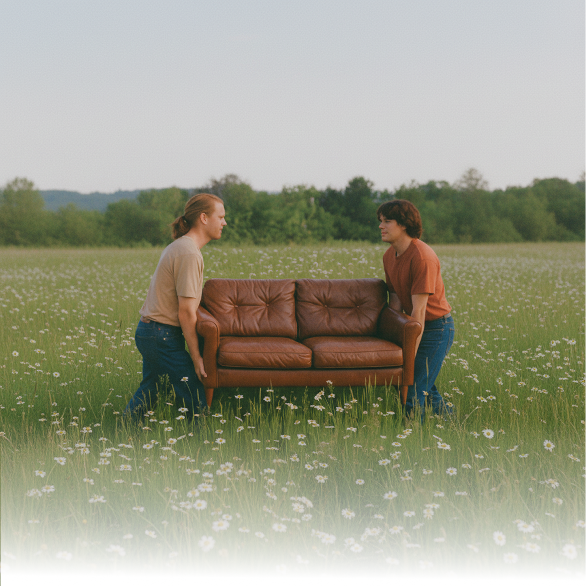
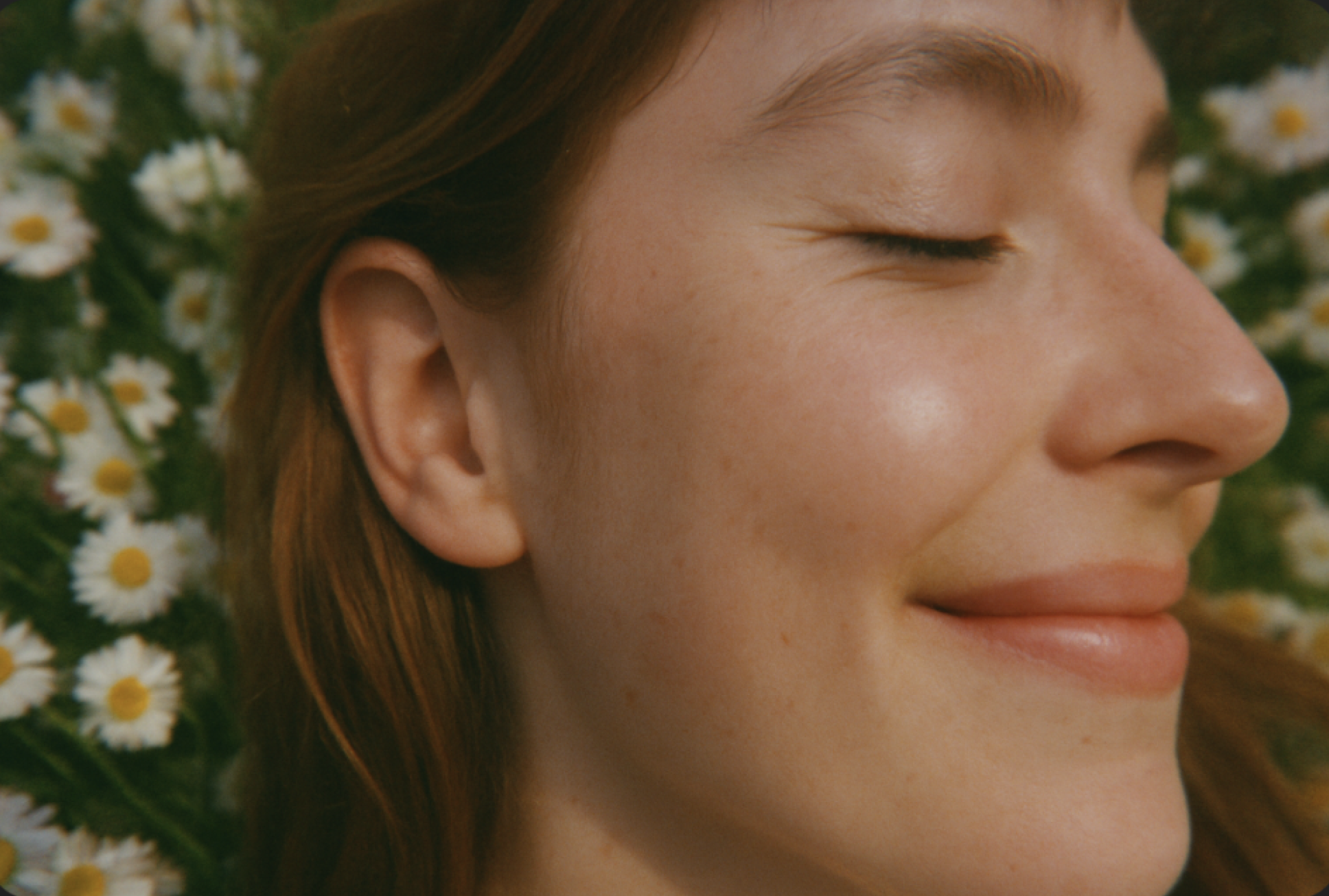
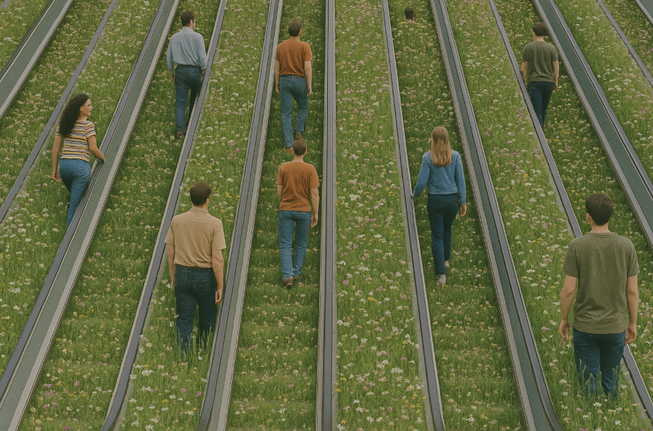
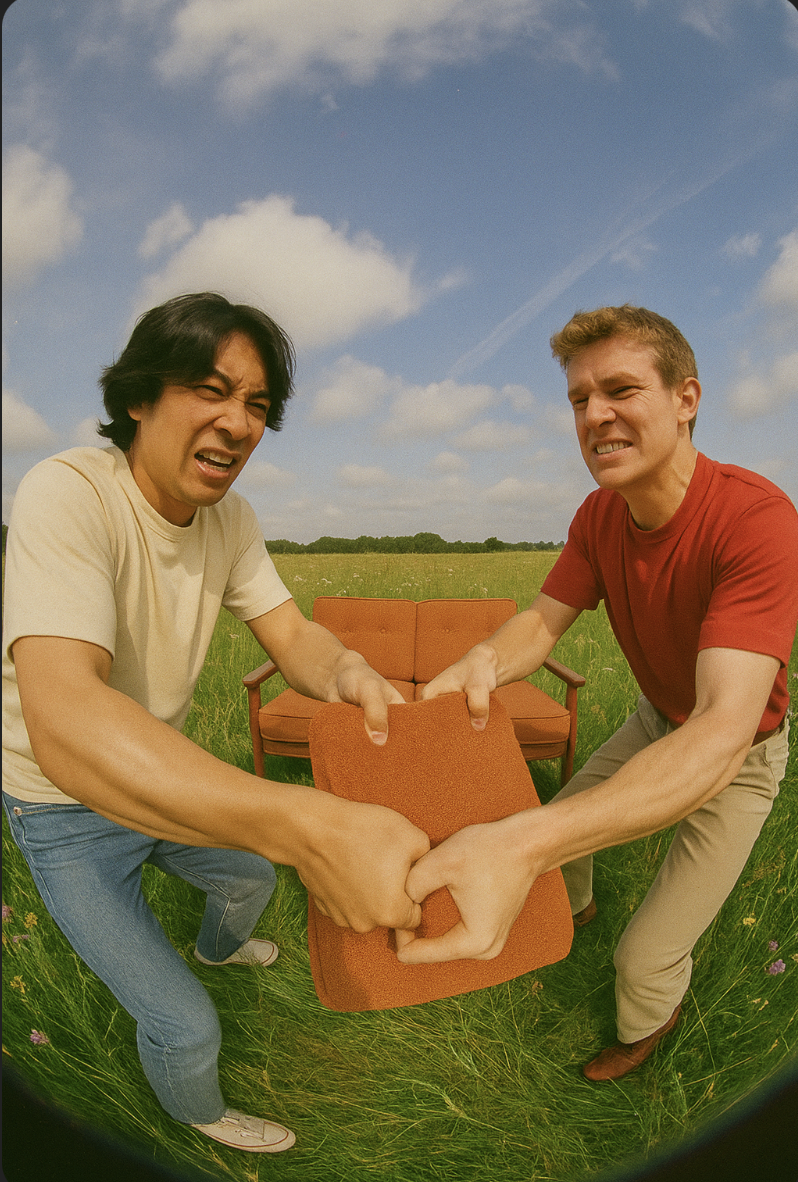
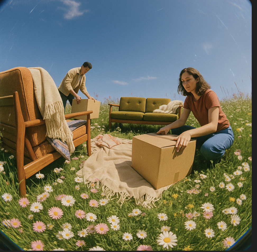
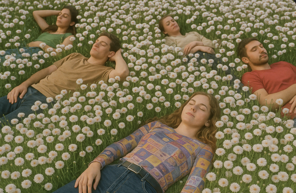
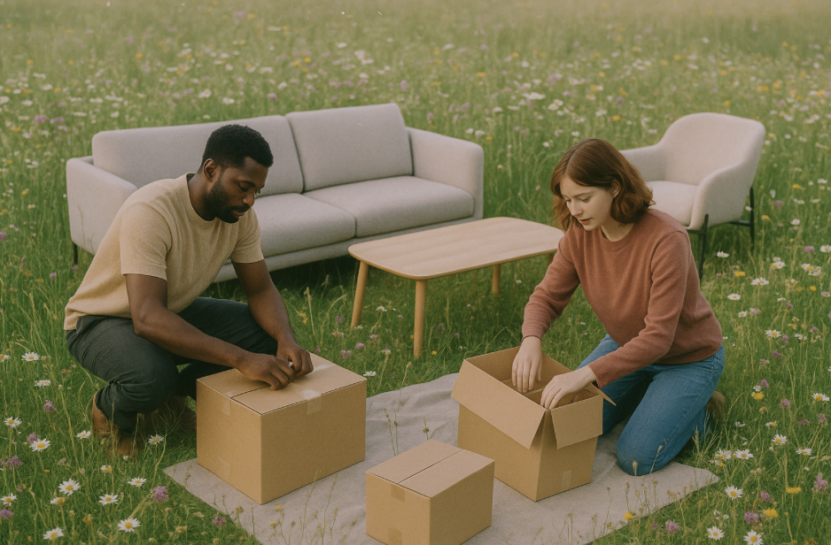
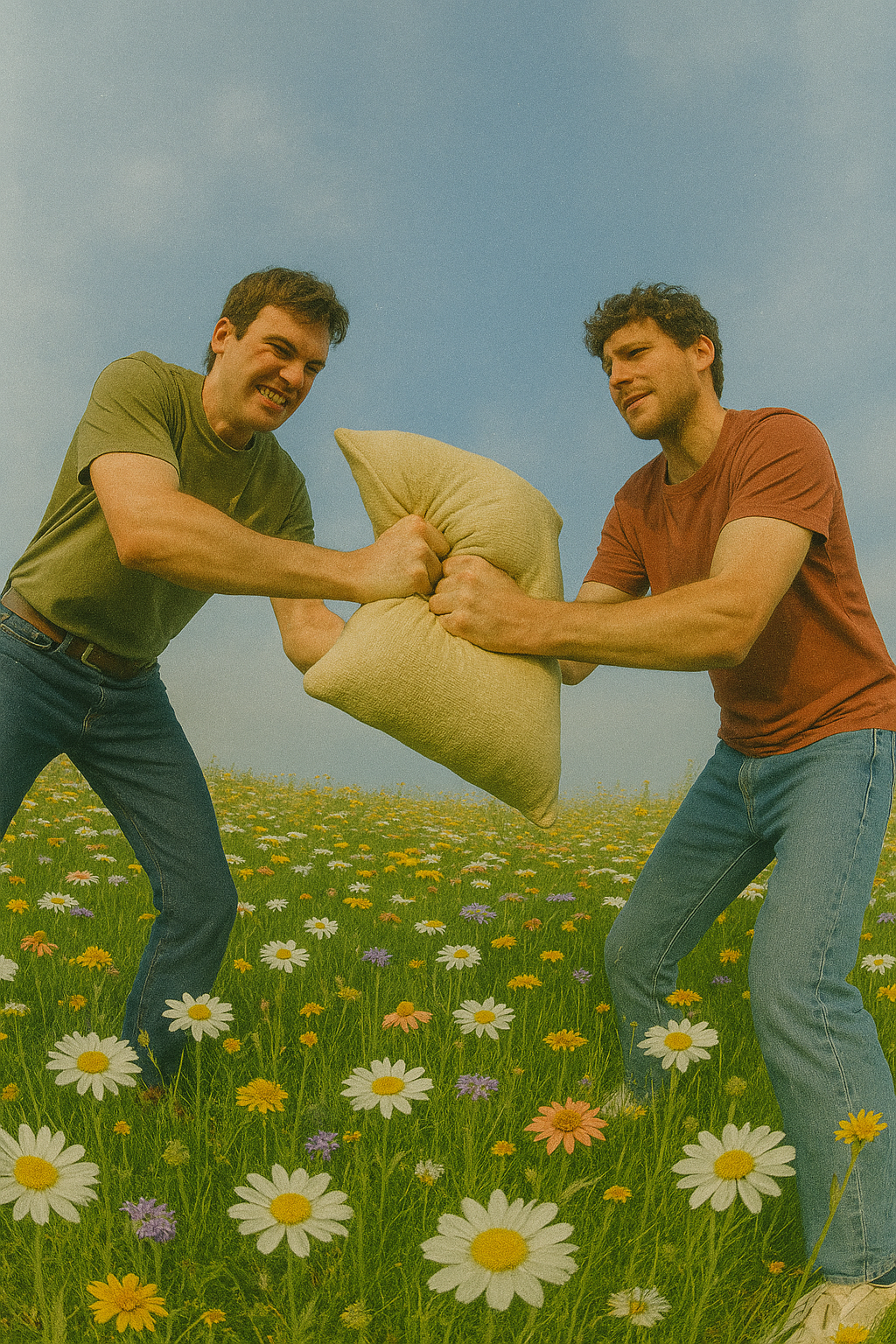
To develop the image library, we crafted a distinct set of AI image-generation prompts rooted in natural camera language. The visuals evoke a sense of nostalgia, capturing moments of people parting ways through a warm, optimistic lens. While playfully tongue-in-cheek — idealizing “greener pastures” — the imagery serves as an imaginative exercise in building a cohesive and distinctive visual universe.
Chat prompts:
A cinematic visual reference guide illustrating lens, lighting, and material vocabulary — showing camera angles (16mm ultra-wide, over-the-shoulder, wide fish eye), lighting types (vibrant tones, golden hour, backlit, low-key), and textures (reflective, iridescent, weathered, diffused). The image should feel dreamlike, nostalgic, and moody, with warm tones, soft blur, chromatic aberration, film grain, and haze. Setting should include domestic scenes and interiors laid out in a green field of daisies under blue skies.
Lenses & Camera Angles
- 35mm or 50mm prime lens — natural perspective with slight compression
- Wide shot with shallow depth of field for environmental context
- Eye-level or slightly low angle for intimacy and immersion
Lighting Descriptors
- Soft diffused daylight or golden hour glow
- Backlit subject with natural bounce fill
- Low-key contrast with ambient falloff
- Subtle light leak and edge lens flare
- Practical lights adding warmth in-frame
Material & Texture Terms
- Matte, weathered surfaces with organic imperfections
- Soft focus and light atmospheric haze
- Reflective or iridescent accents catching highlights
- Floating dust particles visible in backlight
- Fine film grain and gentle blur from shallow DOF
Atmosphere & Mood
- Dreamlike, introspective, nostalgic
- Ethereal calm with a hint of melancholy
- Whimsical sense of stillness and memory
Color & Tone
- primary palette with warm undertones
- Soft golden-pink highlights, cool blue shadows
- Gentle chromatic aberration at light edges
- Filmic warmth with diffused highlights and haze
Camera Language
- shot form below/wide framing balancing subject and environment
- Aperture between f/1.8–f/2.8 for cinematic depth
- Static composition or slow drift for serenity
- Shallow focus and creamy bokeh for dreamy realism




Screen Building: High Fidelity Components
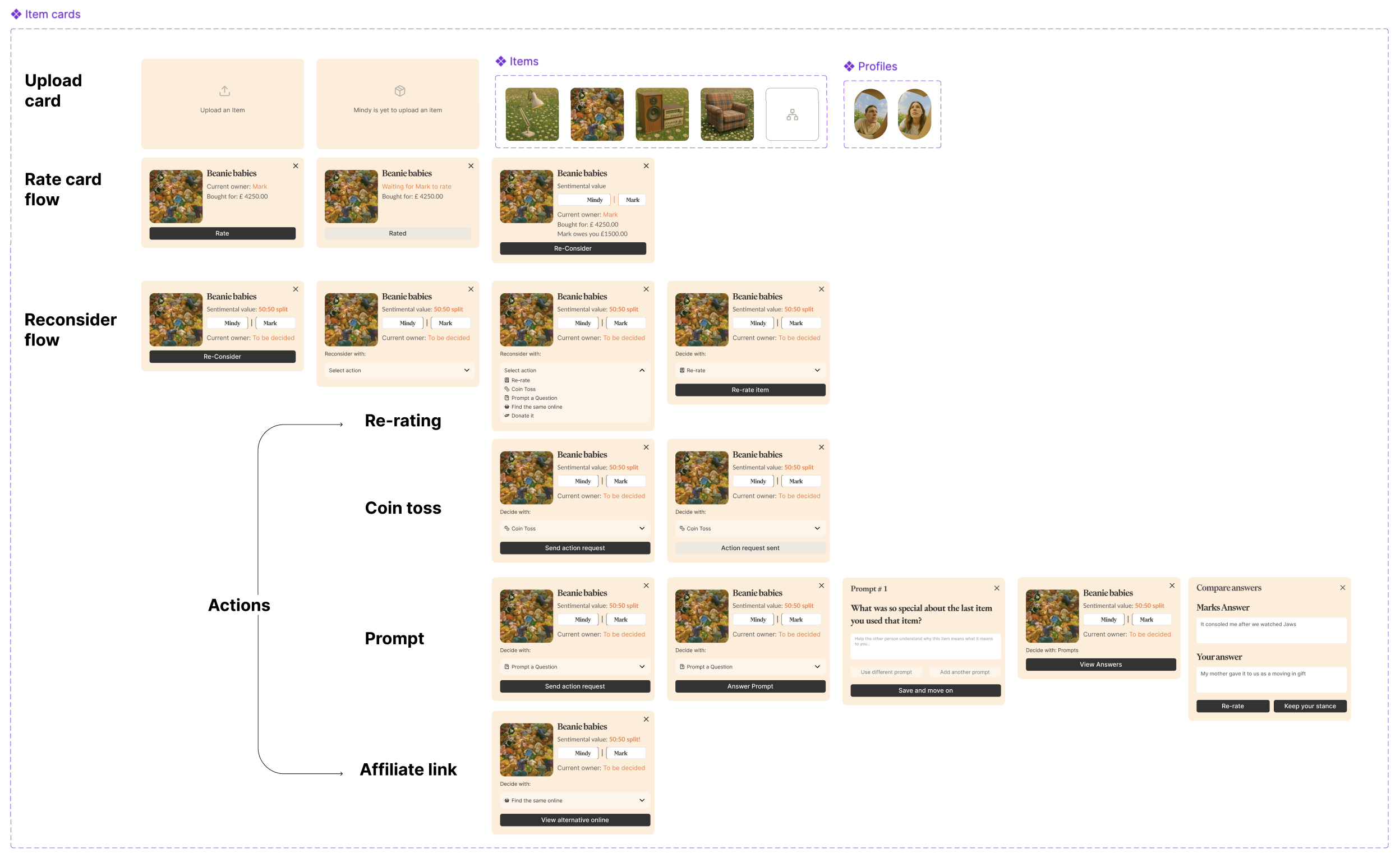
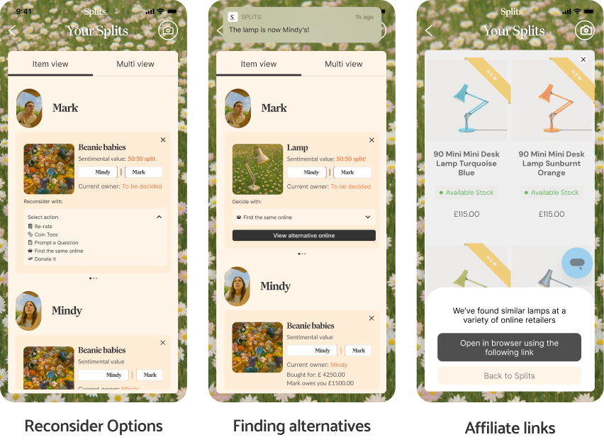
We built a series of card styles that outlined the app’s core functionalities. These included options to reconsider choices, mediate a 50:50 division via a coin toss, purchase a similar item through an affiliate link, donate an item, or prompt a deeper conversation about the item’s meaning for each person involved.
Higher Fidelity Prototypes
Content Display methods
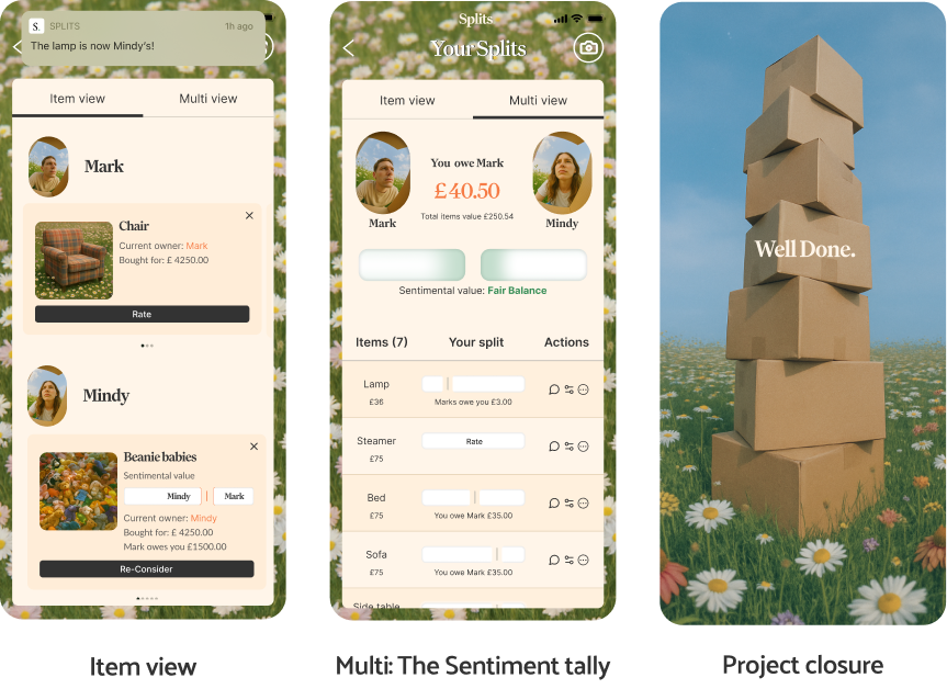
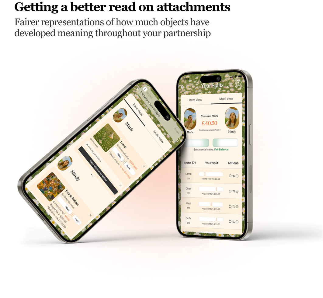
The card styles were displayed in two formats — one highlighting each person’s ownership of specific items, and another offering a broader view of how sentiment and fairness were balanced across everything.
The card styles were displayed in two main views.
- In the Item View, users could see which items belonged to whom and use different options to rethink or negotiate ownership.
- The Multi-View then tallied the financial value of each item in relation to sentimental attachment, combining emotional and monetary inputs to show where the split felt fair. Even if the split wasn’t balanced, this view still revealed the total amount each person was owed overall.
Building out additional capabilities
Conclusion:
This personal project was an enjoyable exercise in developing a concept without being beholden to user research and just pursuing craft for crafts sake.
Getting a better read on attachments
A fairer representations of how much objects have developed meaning throughout a partnership
The case for interaction design:
If humans were naturally gifted with perfect conflict-mediation skills and truly attentive listeners, an app like this wouldn’t need to exist. Yet, the fact that it exposes subtle moments in our shared reality highlights the ongoing opportunity for interaction design — a practice that thrives in the beautifully imperfect space of human behaviour.

Splits.
a fairer way to leave things
Challenge:
There are a lot of dating apps out there. They are so well designed that they keep you dating rather than committing.
I thought it would be interesting to build an app that addresses the other side of the coin - continuous separation.
Cost splitting applications such Splitwise, tri-count, ect. But they are dry by design. They dont want to bring in the messy parts of sharing assets and money.
Is there a problem to solve here?
If there was it would be : Splits an asset splitting app that addresses the sentimental side of parting with objects.

Side project: Splits
UI Design exploration
Design system
Visual Universe
UI Engineering Components
April 2025
Process:
Origin Story
Core Interactions
Visual Universe
Building Screens
Additional Interactions
Conclusion
Origin Story
This project started with a little daydream about autolayout and tug of war
Because what if Mindy is more attached to the car?
do they still have to split it evenly?
after years of sharing something is it really about the money you paid for it?
how do you represent how much you both care about something?
In typical design fashion, this led to a “How might we build a series of simple interactions that represent people’s sentimental attachments to shared items, allowing for fairer compromises?”
Core Interactions
I used AI tools Claude MCP and Cursor to build a simple working prototype that brought these interactions to life.
9:41
Splits.
Interaction 1: Tug of War Slider
The goal was to create responsive rectangles similar to Figma’s Auto Layout “fill” behavior. In this prototype, each rectangle’s size is proportional to how much of the total value of an item each individual owns.
Interaction 2: Hold me rating
To capture the emotional side of ownership, I used a press-and-hold interaction — a more intuitive way to express sentiment when there’s no visible or numeric scale. The interaction was designed to link each person’s emotional connection to an item with its financial value, adjusting what they’d pay accordingly.
After finalizing the app’s core mechanics, we needed to develop a visual identity, design card styles, and create higher-fidelity screens.

Prompt Design: Visual universe
To develop the image library, we crafted a distinct set of AI image-generation prompts rooted in natural camera language. The visuals evoke a sense of nostalgia, capturing moments of people parting ways through a warm, optimistic lens. While playfully tongue-in-cheek — idealizing “greener pastures” — the imagery serves as an imaginative exercise in building a cohesive and distinctive visual universe.
Chat prompts:
A cinematic visual reference guide illustrating lens, lighting, and material vocabulary — showing camera angles (16mm ultra-wide, over-the-shoulder, wide fish eye), lighting types (vibrant tones, golden hour, backlit, low-key), and textures (reflective, iridescent, weathered, diffused). The image should feel dreamlike, nostalgic, and moody, with warm tones, soft blur, chromatic aberration, film grain, and haze. Setting should include domestic scenes and interiors laid out in a green field of daisies under blue skies.
Lenses & Camera Angles
- 35mm or 50mm prime lens — natural perspective with slight compression
- Wide shot with shallow depth of field for environmental context
- Eye-level or slightly low angle for intimacy and immersion
Lighting Descriptors
- Soft diffused daylight or golden hour glow
- Backlit subject with natural bounce fill
- Low-key contrast with ambient falloff
- Subtle light leak and edge lens flare
- Practical lights adding warmth in-frame
Material & Texture Terms
- Matte, weathered surfaces with organic imperfections
- Soft focus and light atmospheric haze
- Reflective or iridescent accents catching highlights
- Floating dust particles visible in backlight
- Fine film grain and gentle blur from shallow DOF
Atmosphere & Mood
- Dreamlike, introspective, nostalgic
- Ethereal calm with a hint of melancholy
- Whimsical sense of stillness and memory
Color & Tone
- primary palette with warm undertones
- Soft golden-pink highlights, cool blue shadows
- Gentle chromatic aberration at light edges
- Filmic warmth with diffused highlights and haze
Camera Language
- shot form below/wide framing balancing subject and environment
- Aperture between f/1.8–f/2.8 for cinematic depth
- Static composition or slow drift for serenity
- Shallow focus and creamy bokeh for dreamy realism


Screen Building: High Fidelity Components
We built a series of card styles that outlined the app’s core functionalities. These included options to reconsider choices, mediate a 50:50 division via a coin toss, purchase a similar item through an affiliate link, donate an item, or prompt a deeper conversation about the item’s meaning for each person involved.

Higher Fidelity Prototypes
Content Display methods
The card styles were displayed in two formats — one highlighting each person’s ownership of specific items, and another offering a broader view of how sentiment and fairness were balanced across everything.
The card styles were displayed in two main views.
- In the Item View, users could see which items belonged to whom and use different options to rethink or negotiate ownership.
- The Multi-View then tallied the financial value of each item in relation to sentimental attachment, combining emotional and monetary inputs to show where the split felt fair. Even if the split wasn’t balanced, this view still revealed the total amount each person was owed overall.
Building out additional capabilities


Conclusion:
This personal project was an enjoyable exercise in developing a concept without being beholden to user research and just pursuing craft for crafts sake.
Getting a better read on attachments
A fairer representations of how much objects have developed meaning throughout a partnership

The case for interaction design:
If humans were naturally gifted with perfect conflict-mediation skills and truly attentive listeners, an app like this wouldn’t need to exist. Yet, the fact that it exposes subtle moments in our shared reality highlights the ongoing opportunity for interaction design — a practice that thrives in the beautifully imperfect space of human behaviour.

Splits.
a fairer way to leave things
Challenge:
There are a lot of dating apps out there. They are so well designed that they keep you dating rather than committing.
I thought it would be interesting to build an app that addresses the other side of the coin - continuous separation.
Cost splitting applications such Splitwise, tri-count, ect. But they are dry by design. They dont want to bring in the messy parts of sharing assets and money.
Is there a problem to solve here?
If there was it would be : Splits, an asset splitting app that addresses the sentimental side of parting with objects.

Side project: Splits
UI Design exploration
Design system
Visual Universe
UI Engineering Components
April 2025
Process:
Origin Story
Core Interactions
Visual Universe
Building Screens
Additional Interactions
Conclusion
Origin Story
This project started with a little daydream about autolayout and tug of war
Because what if Mindy is more attached to the car?
do they still have to split it evenly?
after years of sharing something is it really about the money you paid for it?
how do you represent how much you both care about something?
In typical design fashion, this led to a “How might we build a series of simple interactions that represent people’s sentimental attachments to shared items, allowing for fairer compromises?”
Core Interactions
I used AI tools Claude MCP and Cursor to build a simple working prototype that brought these interactions to life.
Interaction 1: Tug of War Slider
The goal was to create responsive rectangles similar to Figma’s Auto Layout “fill” behavior. In this prototype, each rectangle’s size is proportional to how much of the total value of an item each individual owns.
Interaction 2: Hold me rating
To capture the emotional side of ownership, I used a press-and-hold interaction — a more intuitive way to express sentiment when there’s no visible or numeric scale. The interaction was designed to link each person’s emotional connection to an item with its financial value, adjusting what they’d pay accordingly.
9:41
Splits.
After finalizing the app’s core mechanics, we needed to develop a visual identity, design card styles, and create higher-fidelity screens.

Prompt Design: Visual universe
To develop the image library, we crafted a distinct set of AI image-generation prompts rooted in natural camera language. The visuals evoke a sense of nostalgia, capturing moments of people parting ways through a warm, optimistic lens. While playfully tongue-in-cheek — idealizing “greener pastures” — the imagery serves as an imaginative exercise in building a cohesive and distinctive visual universe.
Chat prompts:
A cinematic visual reference guide illustrating lens, lighting, and material vocabulary — showing camera angles (16mm ultra-wide, over-the-shoulder, wide fish eye), lighting types (vibrant tones, golden hour, backlit, low-key), and textures (reflective, iridescent, weathered, diffused). The image should feel dreamlike, nostalgic, and moody, with warm tones, soft blur, chromatic aberration, film grain, and haze. Setting should include domestic scenes and interiors laid out in a green field of daisies under blue skies.
Lenses & Camera Angles
- 35mm or 50mm prime lens — natural perspective with slight compression
- Wide shot with shallow depth of field for environmental context
- Eye-level or slightly low angle for intimacy and immersion
Lighting Descriptors
- Soft diffused daylight or golden hour glow
- Backlit subject with natural bounce fill
- Low-key contrast with ambient falloff
- Subtle light leak and edge lens flare
- Practical lights adding warmth in-frame
Material & Texture Terms
- Matte, weathered surfaces with organic imperfections
- Soft focus and light atmospheric haze
- Reflective or iridescent accents catching highlights
- Floating dust particles visible in backlight
- Fine film grain and gentle blur from shallow DOF
Atmosphere & Mood
- Dreamlike, introspective, nostalgic
- Ethereal calm with a hint of melancholy
- Whimsical sense of stillness and memory
Color & Tone
- primary palette with warm undertones
- Soft golden-pink highlights, cool blue shadows
- Gentle chromatic aberration at light edges
- Filmic warmth with diffused highlights and haze
Camera Language
- shot form below/wide framing balancing subject and environment
- Aperture between f/1.8–f/2.8 for cinematic depth
- Static composition or slow drift for serenity
- Shallow focus and creamy bokeh for dreamy realism


Screen Building: High Fidelity Components
We built a series of card styles that outlined the app’s core functionalities. These included options to reconsider choices, mediate a 50:50 division via a coin toss, purchase a similar item through an affiliate link, donate an item, or prompt a deeper conversation about the item’s meaning for each person involved.

Higher Fidelity Prototypes
Content Display methods
The card styles were displayed in two formats — one highlighting each person’s ownership of specific items, and another offering a broader view of how sentiment and fairness were balanced across everything.
The card styles were displayed in two main views.
- In the Item View, users could see which items belonged to whom and use different options to rethink or negotiate ownership.
- The Multi-View then tallied the financial value of each item in relation to sentimental attachment, combining emotional and monetary inputs to show where the split felt fair. Even if the split wasn’t balanced, this view still revealed the total amount each person was owed overall.
Building out additional capabilities


Conclusion:
This personal project was an enjoyable exercise in developing a concept without being beholden to user research and just pursuing craft for crafts sake.
Getting a better read on attachments
A fairer representation of how much objects have developed meaning throughout a partnership

The case for interaction design:
If humans were naturally gifted with perfect conflict-mediation skills and truly attentive listeners, an app like this wouldn’t need to exist. Yet, the fact that it exposes subtle moments in our shared reality highlights the ongoing opportunity for interaction design — a practice that thrives in the beautifully imperfect space of human behaviour.